13 / 02 / 2025 | Business + Digital Marketing
The colour palette of your website is more than just an aesthetic choice – it plays a key role in user experience, engagement, and brand identity. The right combination of colours can make your website feel inviting, trustworthy, and professional, while a poor choice can lead to visual discomfort and high bounce rates. But how do you decide which colours work best for your website? In this guide, we’ll explore how to choose the perfect colour scheme to enhance usability and make your website stand out.
A well-thought-out colour scheme is essential for maintaining a consistent brand identity and ensuring that your website is visually appealing. Without a structured palette, your site can appear chaotic, making it difficult for users to navigate or engage with your content. A carefully selected website colour palette improves readability, reinforces brand recognition, and helps establish an emotional connection with visitors.
Colours have a profound psychological impact, influencing how users perceive your brand. For example, blue is often associated with trust and professionalism, making it a popular choice for corporate websites. Green symbolises growth and harmony, which is why it is commonly used by eco-friendly brands. Bright and vibrant colours create excitement and energy, while muted tones give a sleek and modern feel. Understanding colour psychology ensures that your website conveys the right message to your audience.
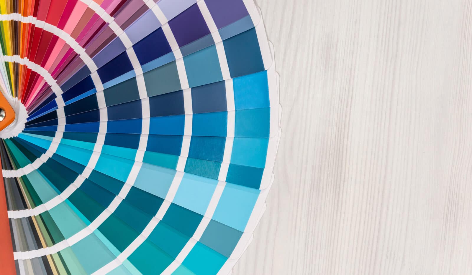
Colour theory is the foundation of any effective website colour palette. It helps designers understand how colours interact, complement each other, and create harmony. A good understanding of colour relationships ensures that your website’s visual elements work together to enhance readability, contrast, and aesthetic appeal.
Primary colours, which include red, blue, and yellow, form the basis of all other colours. These shades cannot be created by mixing others, making them essential for establishing a balanced palette. Secondary colours, such as green, orange, and purple, are created by blending two primary colours and can add vibrancy to a modern website colour palette. Tertiary colours, including red-orange, yellow-green, and blue-purple, provide additional depth and variation, allowing for more intricate combinations.
The colour wheel is an essential tool when selecting a website colour palette. It helps designers identify complementary, analogous, and triadic colour schemes, ensuring a balanced and visually appealing design. Complementary colours, such as blue and orange, create a striking contrast. Analogous colours, like blue, teal, and green, produce a more harmonious effect, while triadic colour schemes, such as red, blue, and yellow, offer a vibrant yet balanced appearance.
A great website colour scheme isn’t just about selecting appealing colours, it’s about balance and contrast. The most effective palettes typically include a primary colour that represents the brand, a secondary colour that enhances the design, and accent colours that are used sparingly for call-to-action buttons and other key elements. A neutral background, such as white, grey, or black, provides contrast and ensures readability.
Modern website colour palettes often incorporate a mix of bold and neutral tones to create a sophisticated and visually engaging look. High contrast between font colours and background shades is essential for accessibility. For example, dark text on a light background is easier to read than light text on a light background.
The right website colour palette significantly affects how users interact with your content. Colour impacts readability, navigation, and emotional engagement. A well-designed palette ensures that visitors stay engaged, find the information they need easily, and feel comfortable browsing your site.
Website usability studies have shown that people form opinions about a site within seconds, and colour plays a major role in that first impression. A website with too many clashing colours can feel overwhelming, while one with a carefully chosen palette appears more professional and trustworthy. Testing your colours using a website colour palette tester can help you ensure your choices enhance usability.
There is no single best colour scheme for a website, as the right choice depends on your brand, industry, and audience. However, certain colour combinations tend to work well for specific types of websites.
Corporate websites often use blue, grey, and white to convey professionalism and reliability. E-commerce stores may favour red, black, and white to create urgency and encourage purchases. Health and wellness sites often feature green, teal, and earthy tones to promote a sense of calm. Creative portfolios typically incorporate bright and artistic colour combinations to reflect individuality.
Using a website colour palette generator can simplify the process of selecting colours that complement each other. Additionally, experimenting with different shades and tones can help you refine your website colour scheme to best match your brand identity.
A colour palette that looks great on a desktop screen might not have the same impact on mobile devices or tablets. Screen resolutions, brightness settings, and display technologies can alter how colours appear. It’s important to test your website colour palette across different devices to ensure consistency.
A website colour palette tester can be useful in previewing how your chosen colours will look in different settings. This ensures that your design remains visually appealing and user-friendly across various screens.
Choosing the right colour palette for your website is a critical step in building a strong online presence. By understanding colour theory, considering contrast and readability, and testing your choices across different devices, you can create a modern website colour palette that enhances both aesthetics and functionality. Whether you want a bold, colourful website or a sleek, minimalist design, maintaining balance, consistency, and visual harmony is key.
A well-chosen colour palette not only improves the look of your website but also enhances user experience and strengthens brand identity. If you’re unsure where to start, consider using a website colour palette generator to experiment with different combinations. Taking the time to refine your colour choices will ensure your website is visually engaging and memorable.
A colour scheme helps create visual consistency, enhances user experience, and strengthens brand identity. The right colours can influence emotions, engagement, and even conversion rates.
Most websites use a three to five-colour palette, consisting of a primary colour, secondary colour, accent shades, and neutral background tones.
The best colours depend on the brand’s identity and target audience. Blue conveys trust, green represents growth, and red encourages action. Choosing the right colour palette enhances engagement.
Start with your brand colours, use a website colour palette generator, and test different combinations. Ensure contrast for readability and appeal.
A modern colour palette balances bold, muted, and neutral tones while prioritising readability and user experience.
The right colour palette improves navigation, readability, and emotional connection, ensuring users stay engaged and enjoy their time on the site.
Looking to enhance your website with the perfect colour palette? At Boostbery, we specialise in creating visually stunning and user-friendly website designs.
Get in touch today, or pick up the phone and give us a call 01273 582 222.
Delivering results which surpass expectations.
Explore our work.
Let’s talk. Complete the form and we’ll contact you regarding your enquiry.
