James Whittet is a former high stakes professional poker player who now coaches other professionals, entrepreneurs and business owners who are brave enough to gamble on themselves.
David Taplin Director
4
James Whittet is a former high stakes professional poker player who now coaches other professionals, entrepreneurs and business owners who are brave enough to gamble on themselves.
” Life is big and amazing. Live it that way. “
James never set out to be an inspirational life coach, however he took the initiative in the crash of 2008 and through a succession of self-motivated turns, he established himself as one of the ‘go to’ motivational coaches, helping people tackle their day-to-day struggles with positivity and pride.
James had grand plans for his coaching business but needed a robust, confidence inducing brand and website to really take his business to the next level.
The Brief
Starting with the brand, we wanted something that really inspired people to approach James and to take-action with regards to being able to dream big and make it happen with James help and expert guidance.
We would move onto the website and take the brand learnings over to create a site that was geared to giving visitors enough confidence to move forward with a coach like James and all that he could offer.
The Project
Working on several ‘deep-dive’ workshops uncovered a great deal of invaluable information and gave us an insight into the aspirations for the coaching company James had set-up.
James wanted the brand to build confidence and provide potential clients with the desire to follow their dreams and take the necessary action to get in touch to open discussions on how this journey could take place and how James could help.
The look and feel wanted to provide a sense of going on a journey in life and being able to convey a sense of enlightenment.
Our creative team delivered 5 robust concepts that gave James a hard time deciding which direction to take the new brand.
Brand Concept 1
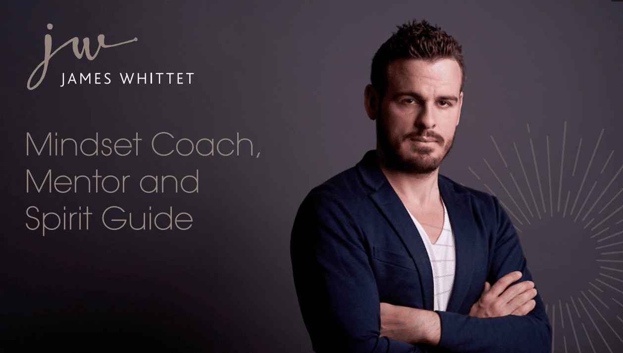
This concept is a reflection of the core values ‘authenticity’ and ‘integrity’. The service James offers is unique and individual – to quote: “I am who I am”. A handwritten, script typeface has been selected to communicate this, with photography of James underpinning the visual style. Graphical elements and secondary typography are modern, yet subtle with an overall feeling of honesty and openness.
This concept is a reflection of the core values ‘authenticity’ and ‘integrity’.
Brand Concept 2
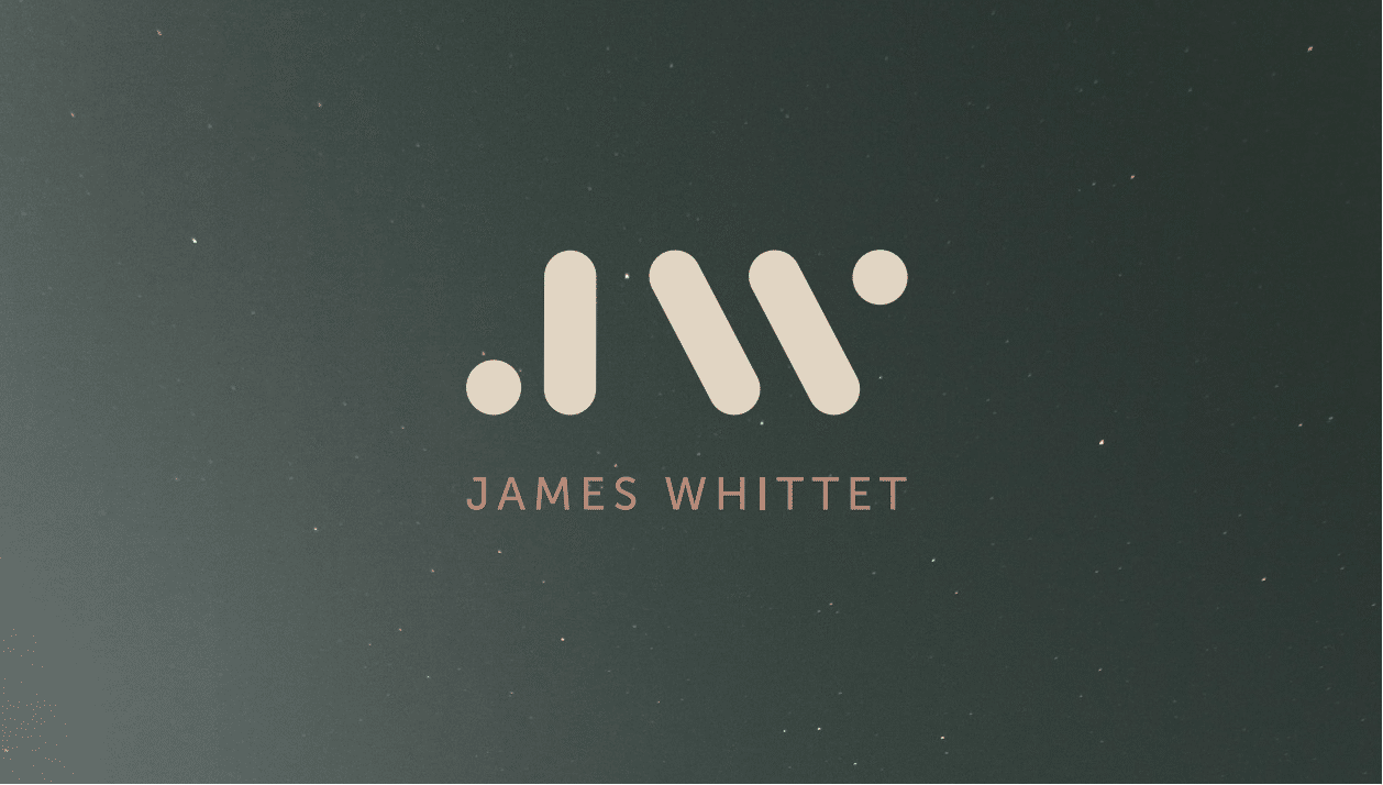
Concept 2 examines the phrase ‘simplicity is power’ from the design brief. The initials ‘JW’ have been broken down into simple shapes that are playful, whilst also retaining a balanced feel that hints towards meditation and a sense of peace. The circles within the logo have been extended throughout the visual language to act as a circle of light – this represents unity, wholeness, and infinity, with James as the mentor to achieve these.
Concept 2 examines the phrase ‘simplicity is power’.
Brand Concept 3
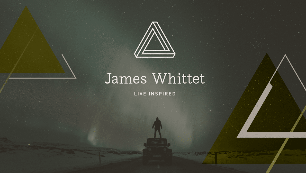
We found that the use of triangles was a common feature during our research phase. Triangles are often used to represent strength and balance, along with representing the number 3 and other concepts such as past, present, and future or spirit, mind, and body. Concept 3 uses triangles as the main design element and abstractly communicates a sense of balance in life.
Concept 3 uses triangles as the main design element and abstractly communicates a sense of balance in life.
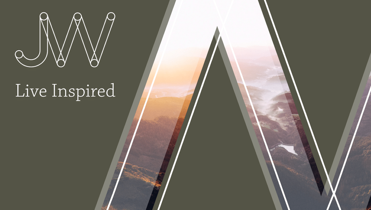
Brand Concept 4
Concept 4 is all about professionalism and authenticity. A bold, premium typeface has been selected for the logo which communicates this sense of quality and integrity. It has been paired with a premium colour palette and photography that blends a feel of earth and nature with the unknown.
Concept 4 is all about professionalism and authenticity.
Brand Concept 5
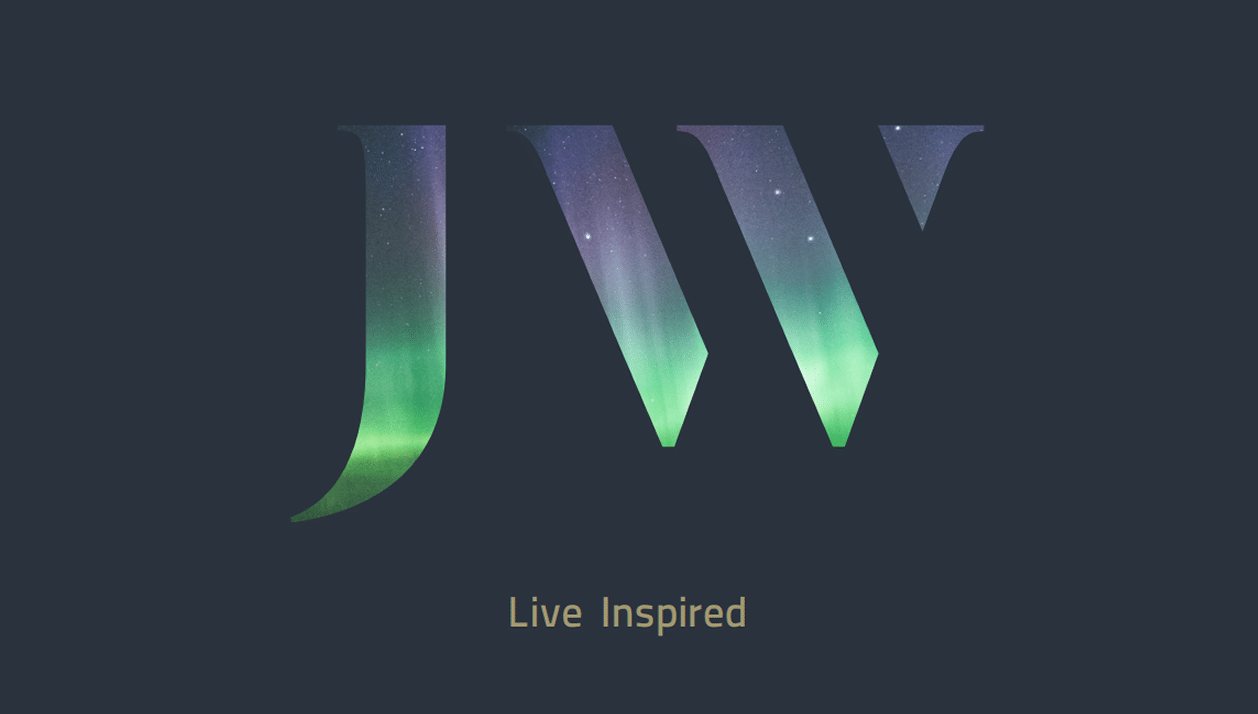
Concept 5 examines the idea of personal development, transition and change. This is communicated through the use of opacity and overlapping shapes within the logo. It is a reflection of the journey a client goes through when working with James. Dawn photography has been selected that captures the moment between dark and light, to mirror this concept of change.
Concept 5 examines the idea of personal development, transition and change.
James was amazed by all of the concepts, however settled on concept 4 as having all of the attributed he need to represent the business moving forward.
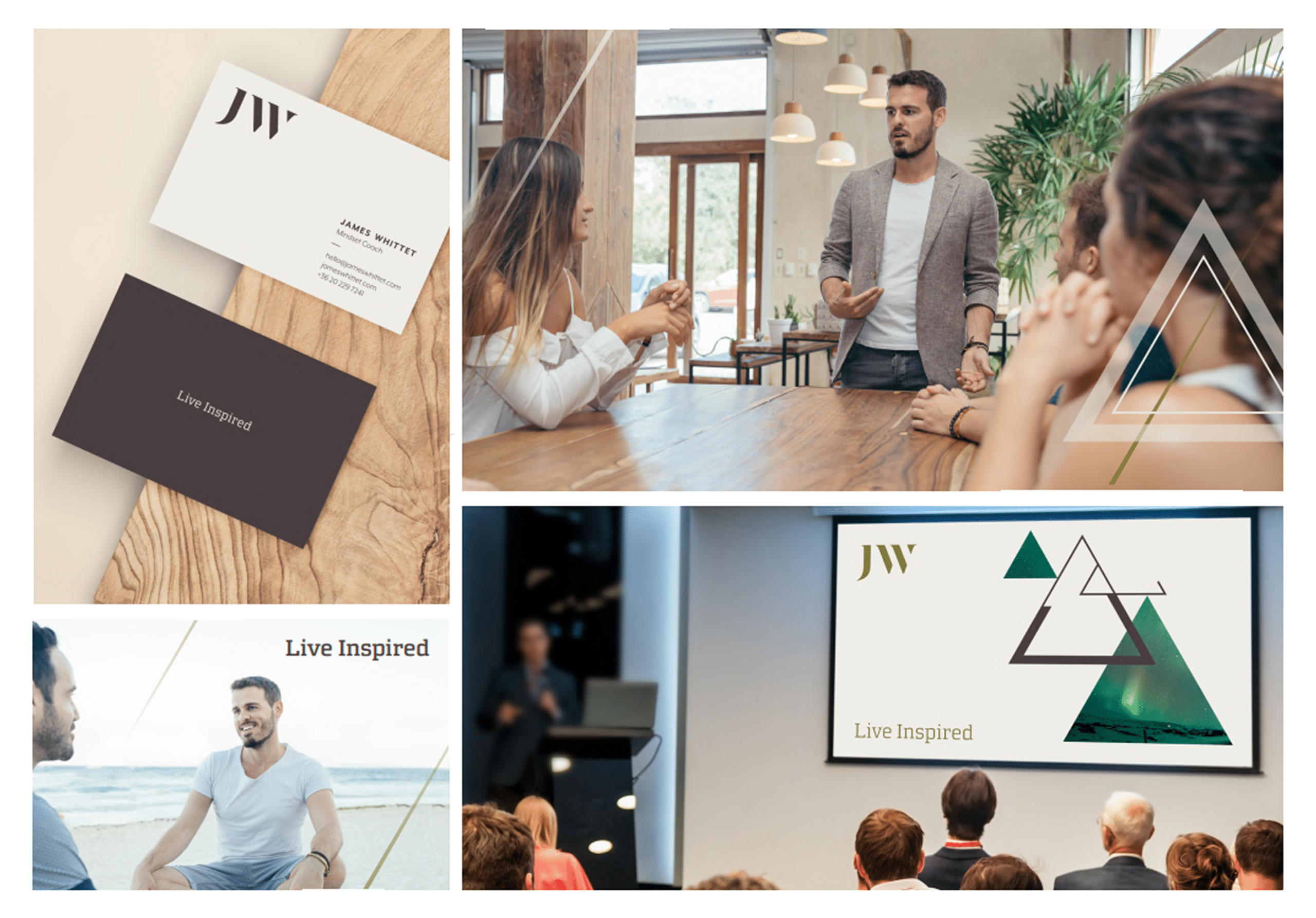
The Solution
The end result was a beautifully robust yet accommodating brand that was an absolute joy to take forward and provide follow-on assets and a stunning website.
James was elated with the final result and it has now provided a solid foundation to give him the confidence to drive his own business forward and appeal to his target market.
More detail on the work we carried out for James Whittet will be on our case studies section of the site soon, but feel free to visit his new site at – www.jameswhittet.com.
James was elated with the final result and it has now provided a solid foundation to give him the confidence to drive his own business forward and appeal to his target market.
Let us Help You Follow your Dreams
We help other reach their dreams with our creative flair and expertise. So why not get in touch and join James and hundreds of others that have worked with us to achieve great things.
If you would like to discuss a new business idea, brand/digital project, would like reach out to us and share your thoughts or need some advice on anything raised in this article, then please do get in touch with us at hello@boostbery.com